How to Create Bump Chart in Tableau

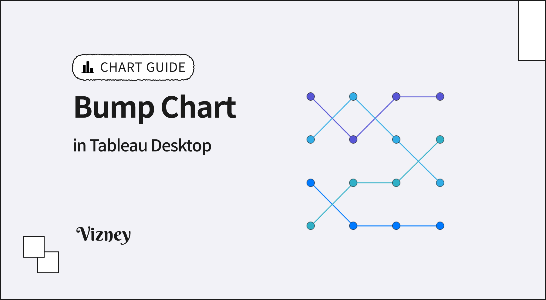
Bump Chart is an intuitive visualization method that displays changes in ranking over time. It is highly effective for understanding relative ranking competition and trends between categories, rather than changes in absolute values.
When creating a bump chart in Tableau, keep these core principles in mind:
- Apply Rank Calculation
Since you need the ranking instead of the raw data values, apply the 'Rank' Quick Table Calculation to your measure. It is crucial to ensure that the table calculation's compute settings are correctly aligned with the dimensions in your view. - Combine Dual Axis (Line & Circle)
Combine a 'Line' mark, which shows the flow of ranking changes, and a 'Circle' mark, which clearly indicates the rank at each point in time, using a Dual Axis. Afterward, synchronize the axes to perfectly align the two marks. - Reverse the Axis
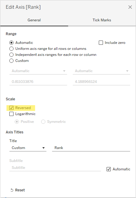
By default, axis values increase from bottom to top. To place the 1st rank at the top of the chart, you must right-click the vertical axis and apply 'Reversed'.
- Highlight for Readability
As the number of categories increases, the lines can become tangled and complex. In this case, color all marks in a light gray and assign colors only to the specific categories you want to highlight for your storytelling. This will result in a much more intuitive visualization.