Vizney
  • Home
  • About
  • Chart Guide
  • Knowledge Base
  • Tips & Tricks
  • Gallery
Sign in Subscribe
Using Treemap Chart in Tableau
Chart Guide

Using Treemap Chart in Tableau

Treemap chart is a highly efficient way to display data within a limited space. By leveraging the size and color of each rectangle, it communicates both proportion and pattern at once, while clearly visualizing hierarchical relationships within the data. In this post, we’ll explore how to use treemap charts
11 Nov 2025 4 min read
How to Create Rounded Bar Chart in Tableau
Chart Guide

How to Create Rounded Bar Chart in Tableau

When visualizing data in Tableau, the basic bar chart is one of the most commonly used chart types. However, even a slight variation in its form can create a completely different impression. Among these variations, the Rounded Bar Chart is a great way to display data values clearly while giving
14 Oct 2025 2 min read
Using Map Chart in Tableau
Chart Guide

Using Map Chart in Tableau

Map chart are one of Tableau’s strengths and are highly useful for visualizing data that includes country or regional values. However, because map charts inherently convey geographic information in addition to the user’s data, they can be somewhat more restrictive compared to other chart types. In this post,
22 Aug 2025 3 min read
How to Create Gauge Chart in Tableau
Chart Guide

How to Create Gauge Chart in Tableau

A gauge chart is a great way to visualize where a current value falls within a defined range at a glance. This guide walks you through how to create one in Tableau.
12 Jun 2025 4 min read
How to Create Radar Chart in Tableau
Chart Guide

How to Create Radar Chart in Tableau

This article explains how to create a radar chart (also known as a spider chart), which is useful for identifying the characteristics of different items.
18 May 2025 2 min read
How to Create Waffle Chart in Tableau
Chart Guide

How to Create Waffle Chart in Tableau

This guide shows you how to create a waffle chart in Tableau—a useful visual for understanding what share a particular item holds in the overall market.
17 Apr 2025 3 min read
How to Create Butterfly Chart in Tableau
Chart Guide

How to Create Butterfly Chart in Tableau

Learn how to create a butterfly chart, a great way to compare two datasets side by side.
31 Mar 2025 2 min read
Using Scatter Chart in Tableau
Chart Guide

Using Scatter Chart in Tableau

Scatter charts are a great way to visualize the distribution of data points. In this post, we’ll explore how to use them more effectively and highlight key considerations to keep in mind. Understanding Scatter Charts as a Distribution Tool Scatter charts plot data points based on two measures, one
17 Mar 2025 3 min read
How to Create Funnel Chart in Tableau
Chart Guide

How to Create Funnel Chart in Tableau

A guide on how to create a funnel chart, which is useful for visualizing step-by-step reductions in a process.
07 Mar 2025 3 min read
Using Grid Chart in Tableau
Chart Guide

Using Grid Chart in Tableau

Tables remain one of the simplest and most reliable ways to present data. While more people are becoming familiar with data visualization and easy-to-use visualization tools continue to emerge, tables are still foundational. So, when does it make sense to use grid charts, and how can they be used most
06 Nov 2024 3 min read
How to Create Candlestick Chart in Tableau
Chart Guide

How to Create Candlestick Chart in Tableau

This guide explains how to create a candlestick chart, commonly seen in stock charts.
26 Oct 2024 3 min read
Using Pie Chart in Tableau
Chart Guide

Using Pie Chart in Tableau

In this post, we'll look at how to use pie charts more effectively in Tableau and some key considerations to keep in mind. Pie Charts for Showing Proportions The main purpose of a pie chart is to show how different segments compare to the whole. It’s best
02 Sep 2024 2 min read
How to Create Donut Chart in Tableau
Chart Guide

How to Create Donut Chart in Tableau

Here’s how to create a donut chart, which is a variation of a pie chart.
31 Aug 2024 3 min read
How to Create Waterfall Chart in Tableau
Members only
Chart Guide

How to Create Waterfall Chart in Tableau

Waterfall chart is especially useful for displaying the factors behind increases and decreases, such as profit and loss in financial data or hires and departures in HR data. In this guide, I’ll walk you through creating a waterfall chart using a Apple’s Q2 2024 Income Statement as an
20 Aug 2024 2 min read
Using Line Charts in Tableau
Chart Guide

Using Line Charts in Tableau

Here's how to effectively use line charts, which are frequently used alongside bar charts. 99% of Line Charts Track Time Line charts are almost always used to show changes in metrics over time. That’s why it's ideal to place date or time fields on the
12 Aug 2024 2 min read
Using Bar Charts in Tableau
Chart Guide

Using Bar Charts in Tableau

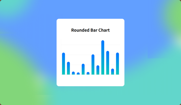
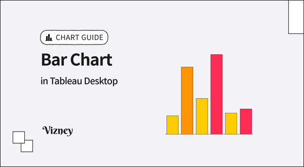
Bar charts, along with line charts, are among the most fundamental types of charts and can be useful in most situations. While creating bar charts is simple and widely done, I'll introduce ways to enhance their impact through subtle differences. Horizontal for rank and list, vertical for flow
13 Jul 2024 3 min read
Page 1 of 1
Vizney © 2025
  • Sign up
Powered by Ghost