
Using Connected Scatter Chart in Tableau

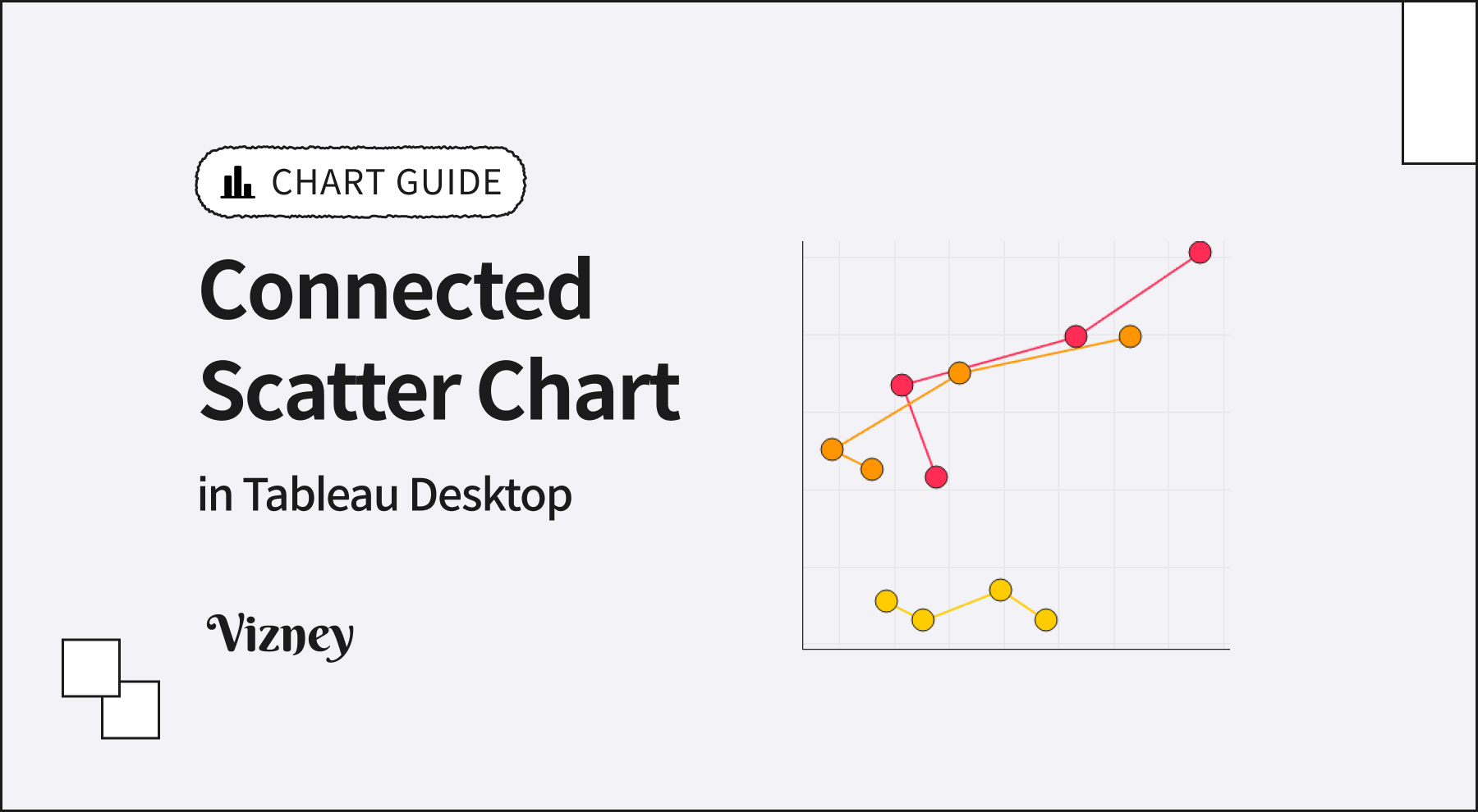
A connected scatter chart links the points of a scatter plot in time order. It shows the relationship between two measures and how that relationship has changed over time, all in a single view. Because most audiences see it less often than other charts, it pays to understand how to read it and when it fits.
Time Is Encoded in the Line, Not on an Axis
A standard line chart places time on the x-axis. A connected scatter chart uses both axes for measures and encodes time only through the order in which points are connected. This means lines can double back to the left or turn downward. Either movement simply indicates that a measure declined during that period.
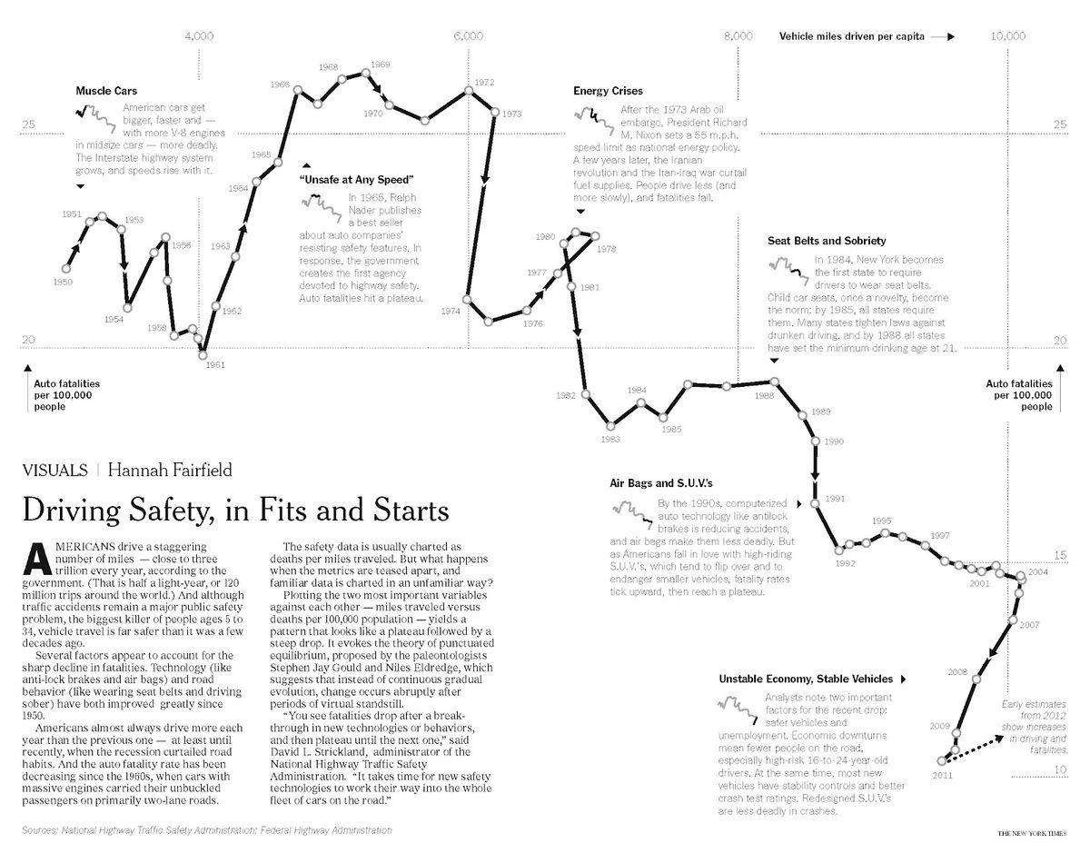
Hannah Fairfield's 2012 New York Times graphic "Driving Safety, in Fits and Starts" is a well-known example of this chart type. Vehicle miles driven per capita runs along the x-axis, and auto fatalities per 100,000 people runs along the y-axis. From 1950 to 2011, miles driven rose in most years. Fatality rates, however, moved in plateaus and sharp drops, stepping downward over time. During the 1970s energy crises and the late-2000s recession, driving itself declined, and the line bends to the left. Two separate line charts would hide this pattern.
Reading Direction and Slope
The direction of each segment shows the change in both measures at once.
- Up and right: both measures increased
- Down and right: the x measure increased while the y measure decreased
- Up and left: the x measure decreased while the y measure increased
- Down and left: both measures decreased
Segment length reflects the size of the change. Slope reflects the ratio between the two changes.
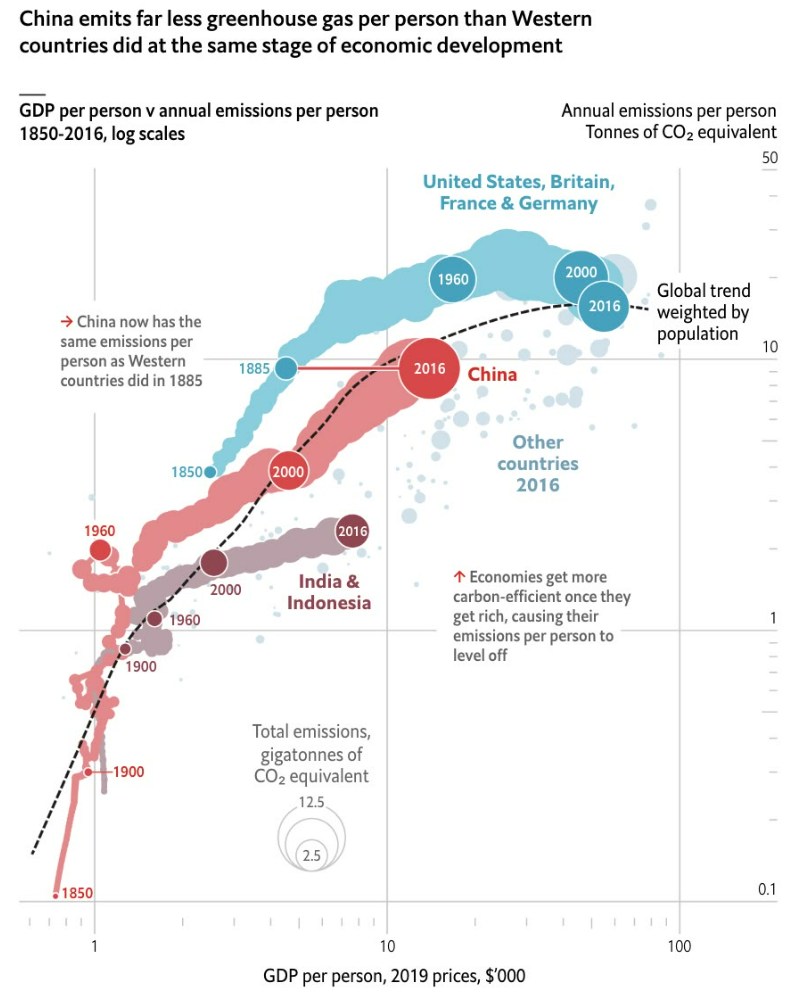
The chart can also compare items by state rather than by calendar year. The Economist's chart plots GDP per person against greenhouse gas emissions per person from 1850 to 2016 on log scales. This places China's current position next to the point where Western countries stood at the same income level. Trajectories from different eras can share one coordinate space. As the bubble sizes for total emissions show, size or color can add a third variable.
Keep Series and Time Points Few, and Mark the Start and End
Too many series or time points cause lines to cross and loop until the chart becomes tangled. Limit the comparison to a handful of items. If there are many time points, roll dates up from month to quarter or year.
Readers need to see where each line starts and ends to follow its direction. Put the date field on Label and set Marks to Label to Line Ends, so only the first and last points are labeled. If the goal is to show each measure's trend rather than the relationship between them, a standard line chart is the better choice.