Drawing Origin–Destination Paths in Tableau

In Tableau’s map charts, you can not only visualize the locations of individual points but also draw connecting lines between them. This feature is particularly useful for showing relationships between countries or visualizing movement paths between locations. However, it requires that you have the latitude and longitude information for each point.
💡
It is not possible to represent such paths using only Tableau’s geographic roles.
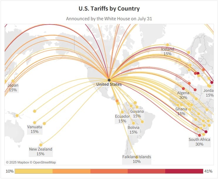
In this post, we’ll demonstrate how to visualize the path from an origin to a destination using U.S. tariff data, a topic that continues to generate global interest. The dataset used here contains reciprocal tariff figures announced by the White House on July 31.
Further Modifying the Reciprocal Tariff Rates
By the authority vested in me as President by the Constitution and the laws of the United States of America, including the International Emergency

Step-by-Step: Drawing Origin–Destination Paths
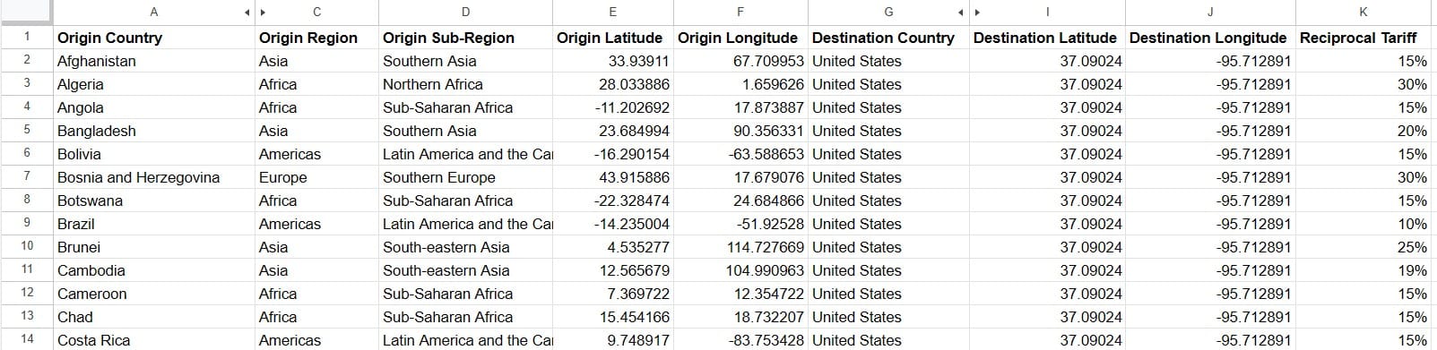
- Prepare your data so that each row contains both the origin and destination’s latitude and longitude. The origin and destination information must be in the same row.
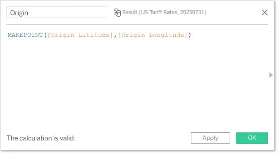
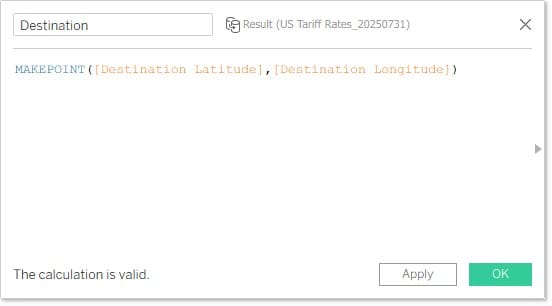
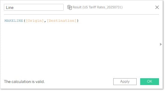
- Create fields using the
MAKEPOINTfunction to generate coordinates for the origin (Origin) and destination (Destination) based on their latitude and longitude values.
- Use the
MAKELINEfunction to create a field that connects the two points—origin and destination.
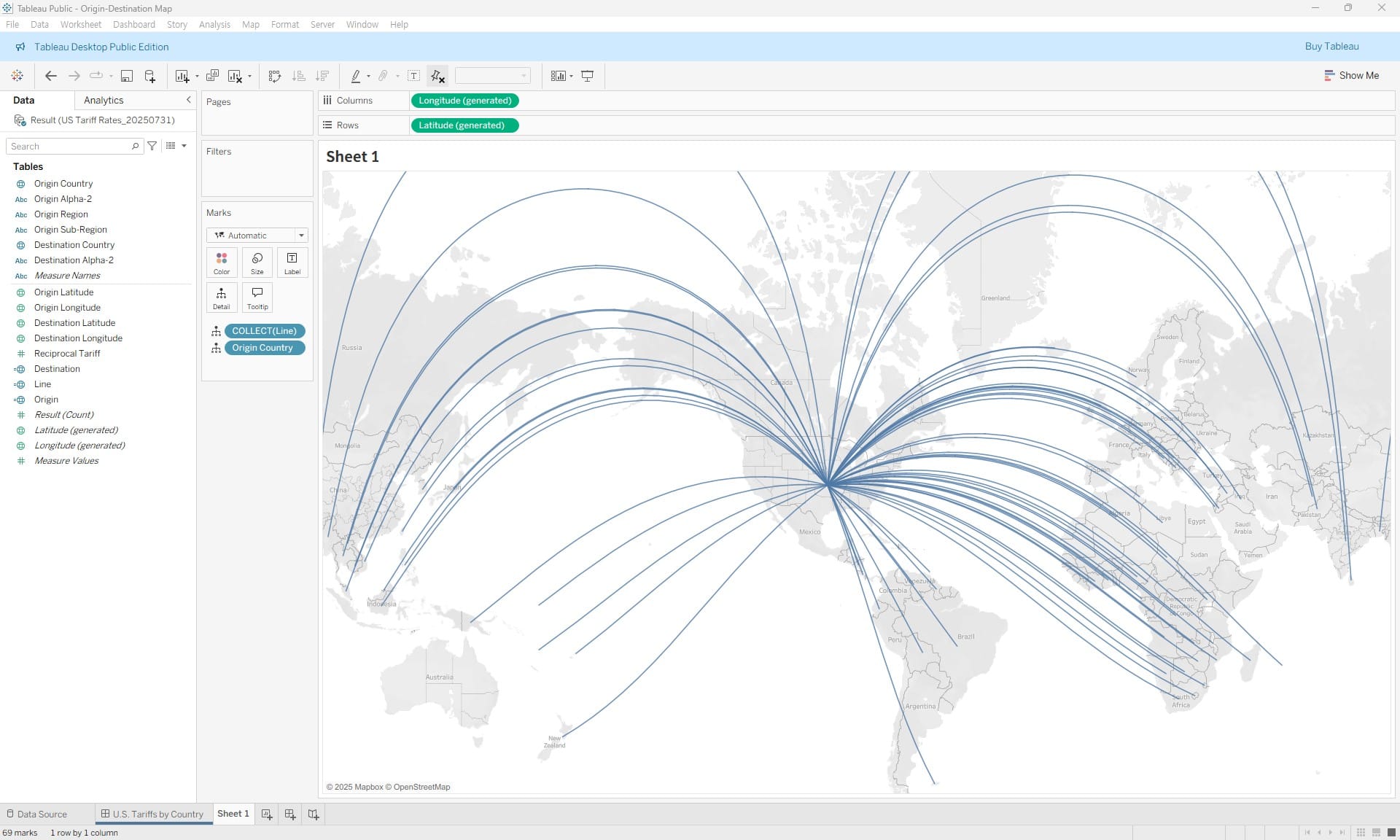
- Double-click the created
Linefield to add it to the sheet. To distinguish each line as a separate object, add the Origin Country field to the Detail shelf.
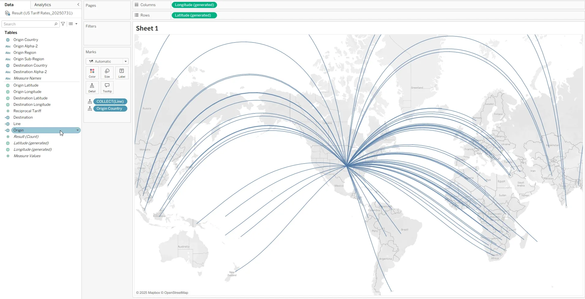
- Add the two
MAKEPOINTfields (origin and destination) to the marks layer to help differentiate between the two points.
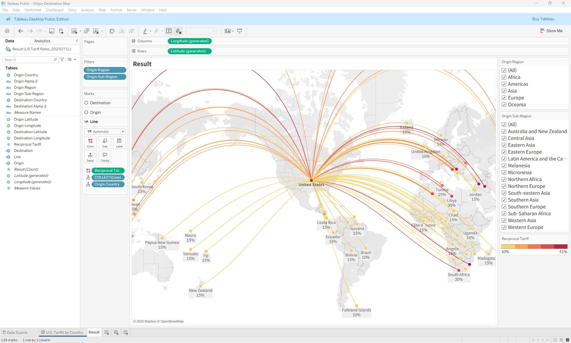
- Add the tariff data by country to the Color shelf and enable labels to complete the chart.
💡
If the dataset contains too many points to display effectively, use filters to allow users to focus on specific parts of the data.