How to Create Rounded Bar Chart in Tableau

When visualizing data in Tableau, the basic bar chart is one of the most commonly used chart types. However, even a slight variation in its form can create a completely different impression. Among these variations, the Rounded Bar Chart is a great way to display data values clearly while giving your visualization a softer and more polished appearance.
In this post, we’ll walk through how to create a rounded bar chart in Tableau step by step. Starting from a standard bar chart, we’ll explore the detailed settings and design tips needed to round the bar edges. This visualization technique not only enhances readability but also elevates the overall look and feel of your dashboard.
Step-by-Step: Creating a Rounded Bar Chart
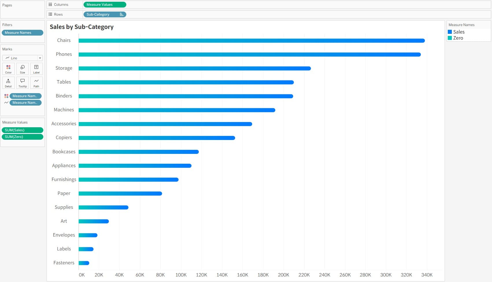
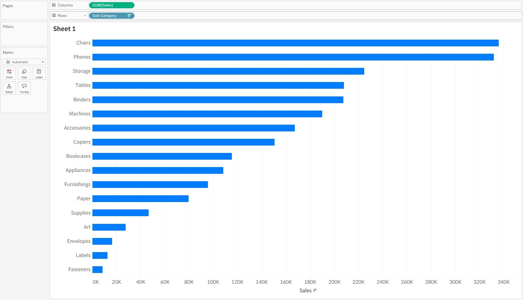
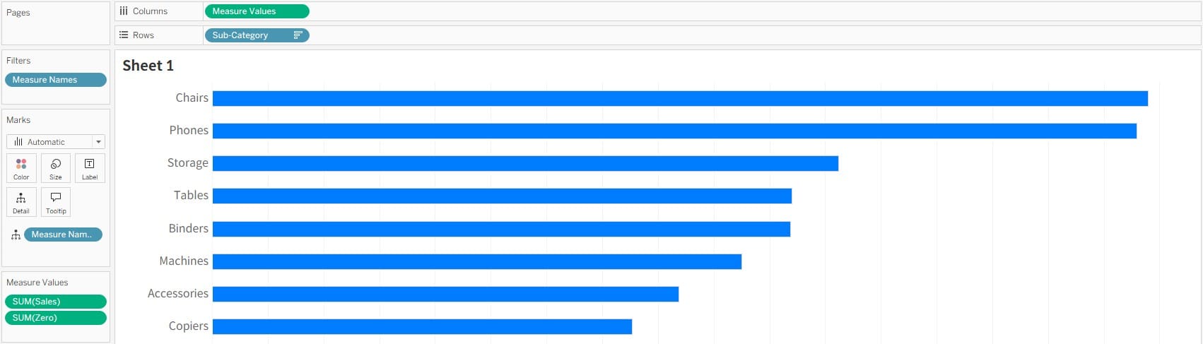
- Set up the fields for your bar chart. In this example, we’ll use Sales by Sub-Category.
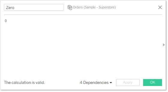
- Create a
Zerofield to use as a reference for shaping the chart.
- Combine the
SalesandZerofields usingMeasure ValuesandMeasure Namesto build the chart.
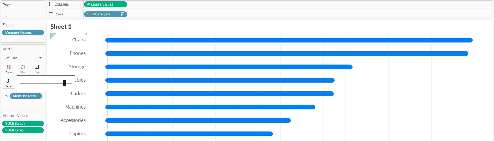
- Change the Mark Type to Line and place
Measure Nameson the Path shelf. This will draw a line between each sub-category’s sales value and zero. Increasing the line size will make it look like a bar.
Additional Option
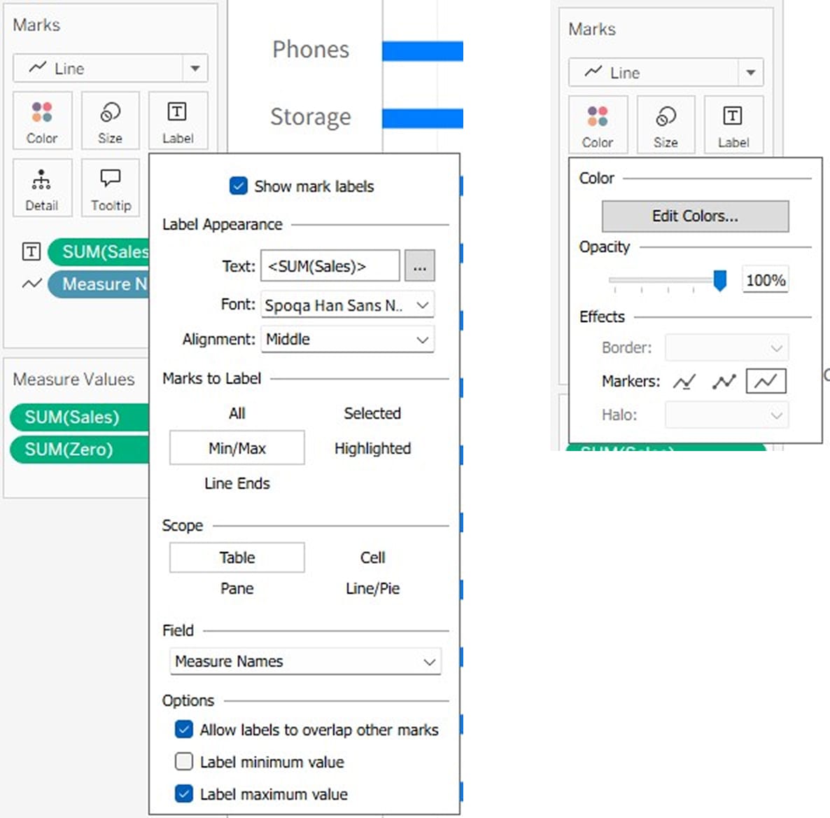
- If you want to display labels:
Use the Maximum/Minimum option on the Label mark to show only the maximum value based onMeasure Names. Then, choose the third marker option under the Color mark to adjust the label appearance appropriately.
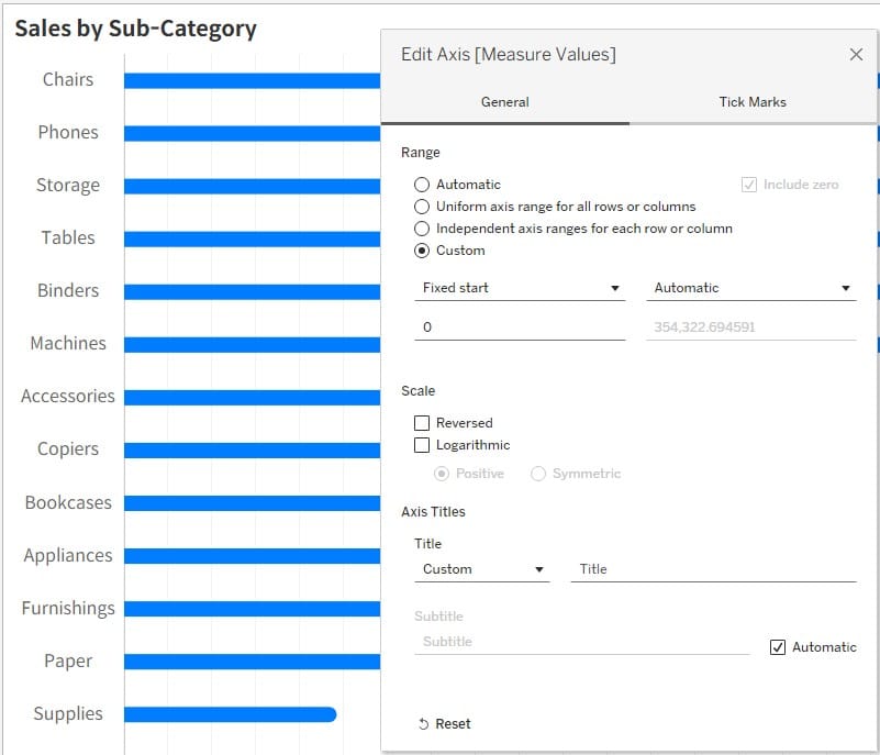
- If you want to keep the 0-axis reference as in a standard bar chart:
Fix the start value to 0 under the axis adjustment options.
- If you want to apply a gradient color to the bars:
AddMeasure Namesto the Color mark and assign different colors to each end of the bar to create a gradient effect.