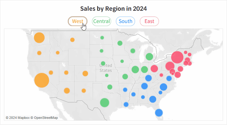
Smartphone Launch Trend Analysis

In the smartphone market, even within the same brand, models with different prices and features are released throughout the year. Because each brand targets different customer segments, launch timing and price positioning often follow a recognizable pattern. The goal of this dashboard was to help identify those patterns at a glance.
Requirements
- Visually represent when and at what price each brand releases its smartphones throughout a given year
- Clearly show how premium, mid-range, and budget models are distributed across quarters
- Allow filtering by year, brand, and device type (e.g., smartphone, tablet)
Development
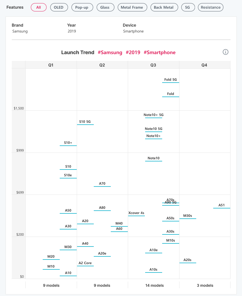
The visualization was designed using launch quarter (x-axis) and launch price (y-axis) for all smartphone models released by a selected brand in a single year.

🧩 How was the data collected?
We crawled data from GSMArena, a website that provides detailed smartphone specifications. The dataset included columns such as year, brand, model name, launch quarter, launch price, and key features (e.g., 5G, metal frame, resistance, etc.).
🧩 How did you handle models that overlap at the same quarter and price?
In many cases, multiple models were released in the same quarter with similar prices, causing overlap on the chart.
Since the goal of this visualization was to observe overall distribution rather than precise price comparison, we applied a small vertical offset using the INDEX function to slightly separate overlapping points. This allowed the overall pattern to remain readable, while exact prices were shown through tooltips.
🧩 The price range is too wide. How was that handled?
Initially, a single linear scale was applied to the y-axis, but prices ranged from around $100 to over $1,500, causing budget models to cluster at the bottom.
To improve readability, prices were grouped into categories such as Low / Mid / High / Premium, and separate axes were used for each range. This approach allowed both high-end and entry-level models to be compared on the same chart while still maintaining detail within each range.
🧩 Doesn’t using multiple axes make the chart confusing?
There was a concern that splitting the axis could complicate the layout, so each range was clearly labeled with distinct price boundaries to minimize confusion. We also adjusted spacing within each segment so that model names were evenly distributed, helping users naturally perceive the boundaries between price ranges.
🧩 What information is displayed in the Tooltip?
Each tooltip displays the model name, launch quarter, launch price, and key features such as 5G or water resistance. This provided enough detail for comparison while keeping the visualization itself clean and uncluttered.
🧩 How were the feature filters implemented?
The Features filter at the top was built using a parameter that allows multiple selections. When All is selected, it automatically clears other options, ensuring intuitive and efficient interaction.