
How to Create an Interactive Custom Legend for Tableau Heatmaps


Heatmaps are highly effective for capturing overall data trends by expressing metric sizes through color gradients. However, relying solely on color shading makes it challenging for users to pinpoint precisely where a specific cell's value falls within the entire spectrum.
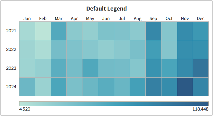
Tableau's default color legend is purely static and cannot dynamically indicate the exact relative level of a hovered cell. To overcome this limitation, you can replace the native color legend with a custom bar chart sheet designed as a legend bar, and link it using a Dashboard Highlight Action.
Core Logic & Approach
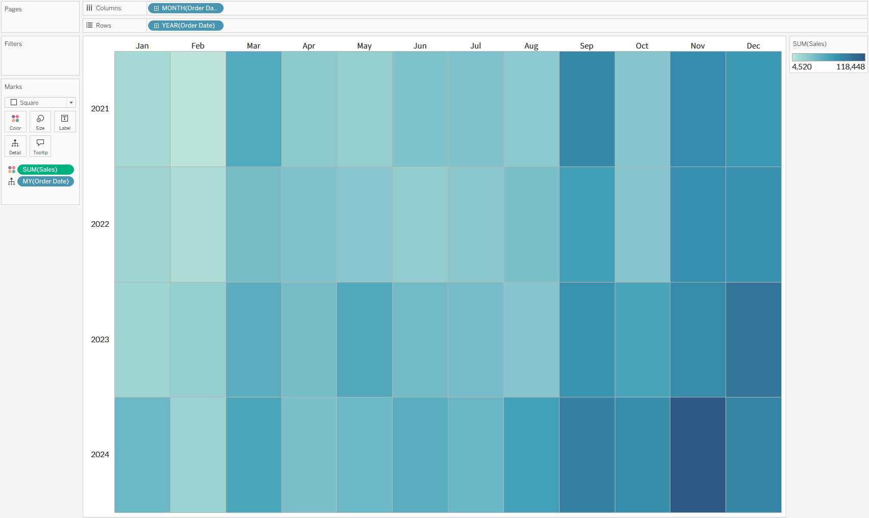
- Build the Main Heatmap Sheet
Create a standard heatmap by placing continuous measures onto the Color mark.
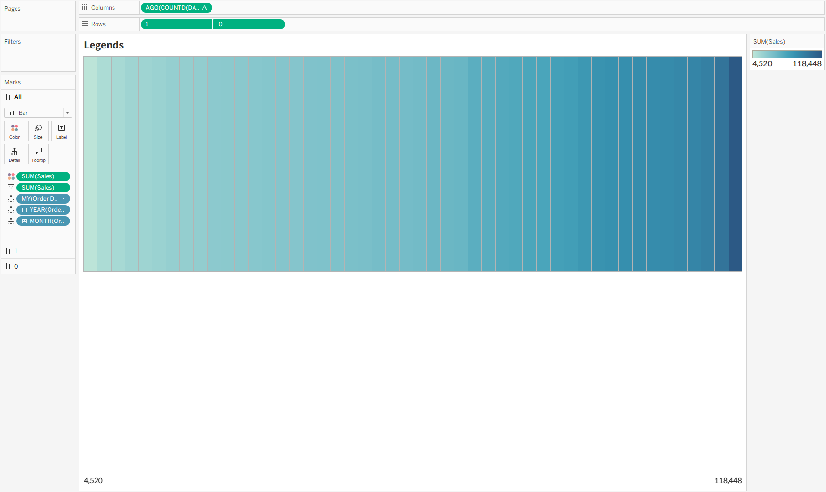
- Create a Custom Legend Sheet
Build a separate worksheet featuring a simple bar chart that spans the full data range. Apply the exact same color palette used in the heatmap to mirror a traditional legend bar.
- Configure Dashboard Highlight Action
Place both sheets on the dashboard, then navigate to [Dashboard] > [Actions] and add a Highlight Action. Set the Heatmap as the Source Sheet, the Custom Legend as the Target Sheet, and choose 'Hover' as the trigger condition.
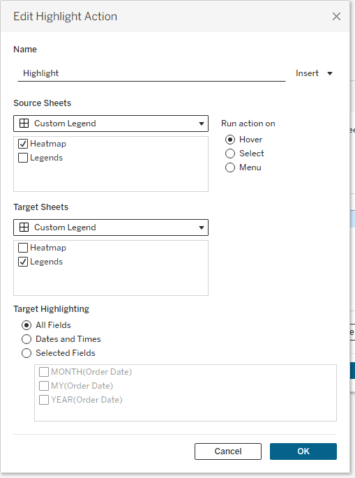
With this setup, hovering over any heatmap cell instantly highlights its corresponding position on the custom legend bar, allowing users to immediately grasp the exact relative magnitude of the data.

To inspect the detailed sheet structures and dashboard action configurations, you can download the example workbook (.twbx) directly from the embedded Tableau Public view below.