Improving the Readability of Overlapping Line Charts in Tableau

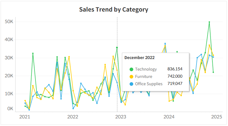
When creating multiple line charts, lines often converge or overlap in certain areas, making it difficult to read individual data values.
By default, hovering over a line only reveals the value for that single item. This means users have to frustratingly navigate their mouse through narrow gaps just to compare multiple figures.
To solve this issue, you can configure the tooltip to display all values for a specific point in time (based on the X-axis) in a single window when hovering over that date.
As shown in the attached image, hovering over a specific date reveals the values and color legends for all items on the chart at once. This allows users to immediately and intuitively compare numbers, even within a complex, tangled chart.
In Tableau, you can easily implement this by utilizing the 'Viz in Tooltip' feature. Try improving your dashboard's readability by grouping information based on a specific point in time rather than relying on individual marks.