Using Treemap Chart in Tableau


Treemap chart is a highly efficient way to display data within a limited space.
By leveraging the size and color of each rectangle, it communicates both proportion and pattern at once, while clearly visualizing hierarchical relationships within the data.
In this post, we’ll explore how to use treemap charts effectively in Tableau.
Showing Proportion and Structure Together
A treemap displays the proportion of each part to the whole, while also revealing the relationship between higher and lower levels. In other words, it’s a visualization that allows you to grasp both composition and hierarchy at a glance.
For example, when visualizing sales composition by product category, the area size of each rectangle can represent total sales, while color can indicate profit margin or growth rate.
- Size → magnitude or proportion of values
- Color → level of performance or rate of change
Since size already conveys proportion, it’s better to assign directional or comparative meaning to color (e.g., increase vs. decrease) to avoid redundancy and enhance interpretability.
Exploring with Hierarchical Structure
One of the greatest strengths of a treemap is its ability to preserve and visualize hierarchical structure. In Tableau, you can drill down from higher-level categories (e.g., Category) to lower-level items (e.g., Sub-category), allowing you to explore both overall structure and detailed data within the same view.
Tableau automatically adjusts the spacing between parent categories when multiple hierarchy levels are present, making each group visually distinct and easier to interpret.

Treemaps are especially useful in the following situations:
- Hierarchical data such as Industry → Company → Brand
- Organizational dashboards showing Department → Team → Member
- Geographic structures like Region → City → Store
As hierarchy depth increases, treemaps help clarify the context of information.
However, displaying too many levels at once can reduce readability—so it’s best to limit the number of visible layers to what’s essential.
Enhancing Insights through Color Contrast
Because treemaps use both area and color simultaneously, color contrast plays a decisive role in revealing insight. Color should not be mere decoration; it should guide how users interpret the data.
- Positive/negative indicators → green–red palette
- Single-metric scale → monochromatic gradient using brightness contrast
- Neutral classifications → gray or pastel tone variations
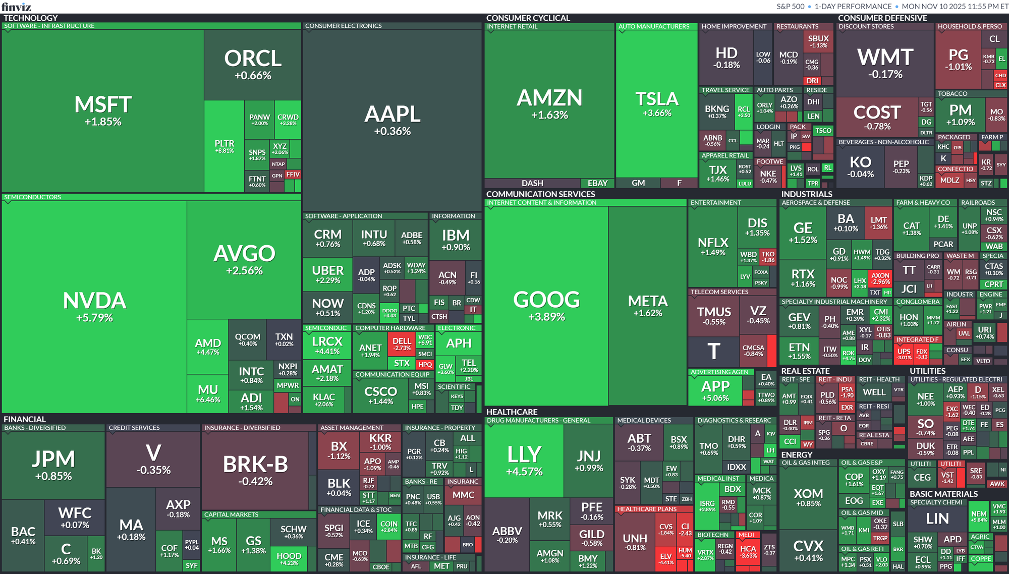
A well-known example of this is the S&P 500 Map. In this visualization, each company’s market capitalization is represented by area size, and its stock price change is indicated by color—allowing the viewer to grasp the market’s overall movement at a glance.
- Green: rising stocks
- Red: declining stocks
- Size: market capitalization
This chart exemplifies the treemap’s greatest strength: it structurally summarizes large datasets while using color to instantly communicate current conditions.
Managing Complexity
Because treemaps have high information density, it’s important to carefully decide how many items to display.
Including too many categories can make small rectangles indistinguishable and distort perception.
Here are some tips to control complexity:
- Display only the top N items and group the rest as Other
- Apply a minimum size condition (MIN SIZE) to hide extremely small values
- Use tooltips to provide additional details
- Enable highlight-on-hover to emphasize small items
Extension: Voronoi Chart
While treemaps are efficient, their rectangular layout can sometimes feel overly rigid. In such cases, you can use a Voronoi chart to represent data through more organic, irregular divisions.

A Voronoi chart divides space irregularly around data points, assigning area size based on each point’s value. Like treemaps, it focuses on proportions, but its organic layout adds visual interest and a sense of spatial balance.
In Tableau, Voronoi charts can be implemented using visualization extensions.

Treemaps are an excellent tool for compressing complex data into a clear, structured visualization. By combining area and color effectively, they can reveal not only proportions but also patterns and trends.
However, since treemaps involve size, color, and hierarchy simultaneously, it’s crucial to define clearly what you want to emphasize before designing the view.