How to Create Waterfall Chart in Tableau

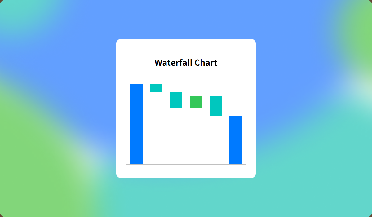
Waterfall chart is especially useful for displaying the factors behind increases and decreases, such as profit and loss in financial data or hires and departures in HR data.
In this guide, I’ll walk you through creating a waterfall chart using a Apple’s Q2 2024 Income Statement as an example.
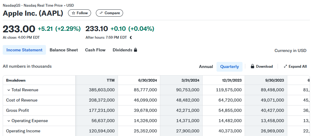
In an income statement, Operating Income is calculated by subtracting the Cost of Revenue and Operating Expense from Total Revenue.
- Operating Income = Total Revenue - Cost of Revenue - Operating Expense
Let’s visualize it as follows:
Step-by-Step: Creating a Waterfall Chart
- Connect Placeholder data to your data source by following the provided guide.
How to Add a Placeholder to Your Tableau Data Source
This method explains how to connect Placeholder data, giving you more flexibility—similar to Excel—and enabling a broader range of visualizations.

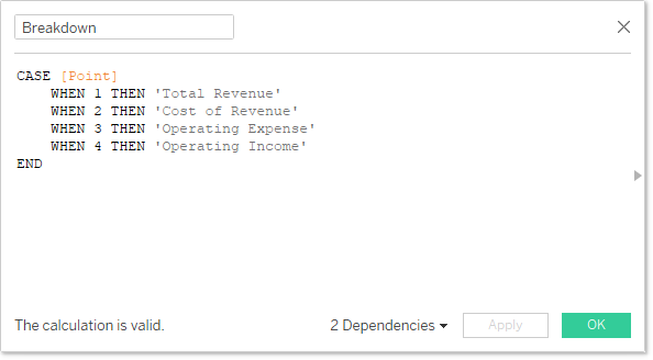
- Create a calculated field to use as header.