How to Create Gauge Chart in Tableau
A gauge chart is a great way to visualize where a current value falls within a defined range at a glance. This guide walks you through how to create one in Tableau.


Although a Gauge chart looks similar to a pie or donut chart, it serves a different purpose. While pie and donut charts emphasize proportions among items, a gauge chart is typically used to:
- Show the current position within a grading or scoring system
- Indicate progress toward a goal
Because color in a gauge chart signals which range the current value belongs to, it’s important to define clear thresholds. Also, since the display is limited to a semicircle, it’s best used for indicators with a fixed and limited range.
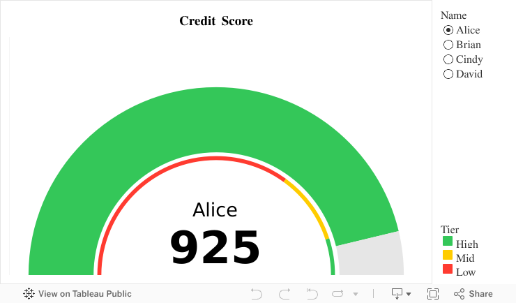
Example: Credit Score and Rating Tiers
This gauge chart example shows which credit tier a person belongs to based on their credit score:
- 900 or above: High
- 700–900: Mid
- Below 700: Low
Here are some key points to keep in mind when building a gauge chart, based on this example:
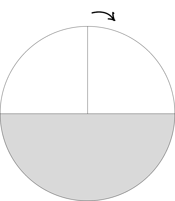
Point 1. Gauge Chart Is Built from a Layered Pie Chart
Gauge charts in Tableau are typically made by layering multiple pie charts. In this case, four concentric layers are used:
- Circle – to display the name and credit score
- Pie – to show the range thresholds (credit tiers)
- Circle – to add separation between the score and the background
- Pie – to represent the actual credit score
If you're unfamiliar with layered pie charts, you can refer to the donut chart tutorial we previously shared.

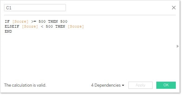
Since gauge charts use only the top half of a circle, you’ll need to adjust your calculations accordingly. In this example, the maximum credit score is 1000, so the top and bottom semicircles each represent 1000 units.
It’s important to note that Tableau’s pie charts always start at the 12 o’clock position. As a result, you need to split the gauge into three zones and define conditions accordingly.
You’ll need to set conditions based on whether the value is above or below 500, and then calculate how much of the semicircle should be filled versus left blank.
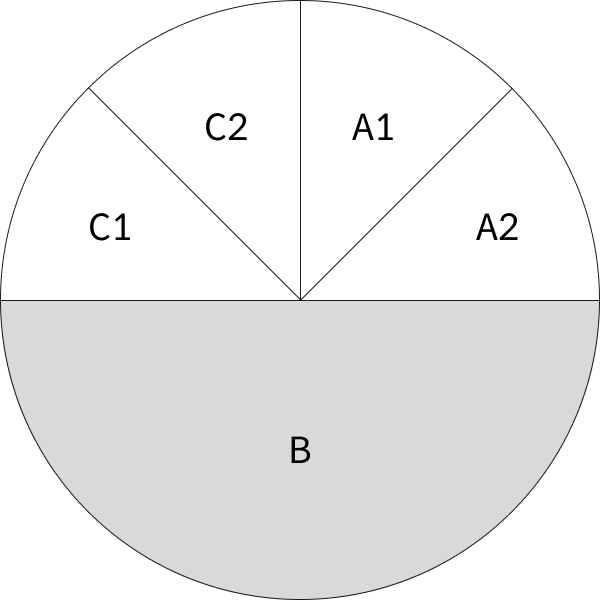
A sample calculation for one segment (C1) is provided in the downloadable file at the end of this post. You can refer to it for the other segments as well.
Point 2. Preparing the Data
You’ll need two data sources:
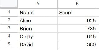
- One with each individual’s credit score
- Another defining the thresholds for each credit rating tier
In the "Credit Tier" sheet, you’ll need to calculate each value’s position on the semicircle and add it as a column. The exact calculation may vary depending on your needs.

Since Tableau doesn’t support dual data sources for hierarchical charts, you’ll need to join the two sheets into one using a dummy key (e.g., a field where 1=1).

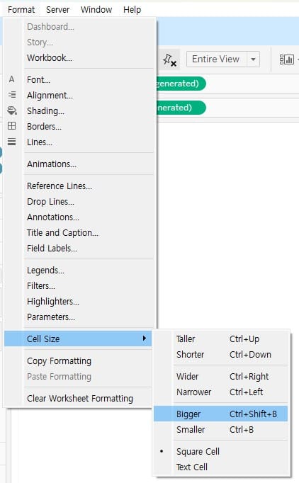
Point 3. Adjusting the Chart Size
Once the chart is complete, you may need to adjust its size depending on where it’s placed on the dashboard. Use the "Cell Size" option under formatting to quickly make size adjustments.
- Bigger:
Ctrl+Shift+B - Smaller:
Ctrl+B
Because gauge charts in Tableau require a more complex setup, it’s difficult to cover every step in writing. For more detailed instructions, we recommend downloading the example file provided below.