How to Create Jitter Plot in Tableau

When visualizing a large number of individual data points on a single axis in Tableau, "overplotting" commonly occurs, where data points with the same values overlap and cluster together. When points overlap in a straight line and look like a thick column, it is difficult to identify the data density in specific areas or the actual shape of the distribution.
The visualization method that solves this and clearly shows the data distribution is the "Jitter Plot." By adding random noise (jitter) to the position of data points to scatter them, you can intuitively compare the data density and outliers across categories. Although Tableau does not have a built-in jitter feature, it can be implemented very simply using a random number generation function.
Step-by-Step: Creating a Jitter Plot
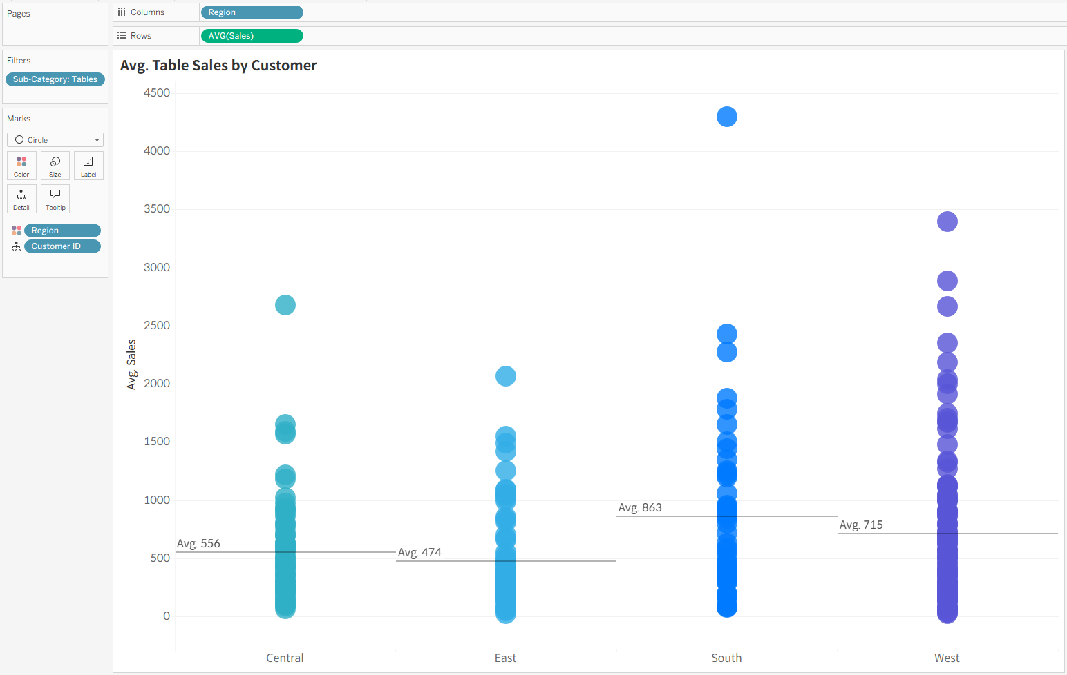
- When you first plot data on a chart, numerous data points are placed on the same X-axis line, overlapping vertically to look like a thick column. In this state, it is visually difficult to gauge where the data is concentrated and what the total volume of the data is.
- Create a new calculated field and enter
RANDOM()in the formula window.
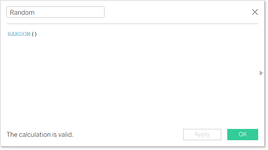
RANDOM() does not appear even if you search for it in Tableau's function list window. However, if you type it directly into the calculation window, it is recognized as a valid function and works normally.- Place the created calculated field directly to the right of the existing dimension pill on the Columns shelf.
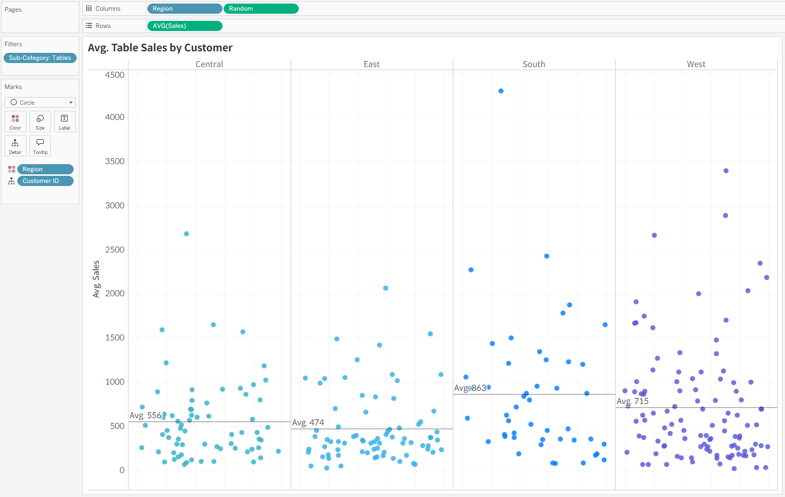
By following these two steps, the RANDOM() function assigns a random number between 0 and 1 to each data point. As a result, the points that overlapped in a straight line are naturally scattered left and right, allowing you to grasp the actual volume and density of the data for each item at a glance.