How to Create Radar Chart in Tableau
This article explains how to create a radar chart (also known as a spider chart), which is useful for identifying the characteristics of different items.

Radar chart is useful when a single subject has multiple attributes, allowing you to easily compare those attributes against each other. Typically, attribute values are represented on a scale from zero to a maximum value. If each item has a different range of values, normalization is used to standardize the axis ranges before building the chart.
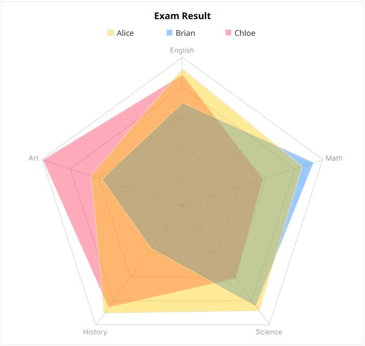
Radar charts are commonly used to analyze athletes or visualize the abilities of game characters, helping you quickly identify strengths and weaknesses at a glance. Rather than focusing on precise values, the chart provides an overview and is particularly effective when comparing two or more subjects.
In this tutorial, we’ll walk through how to create a radar chart using the test scores of three students.
Step-by-Step: Building a Radar Chart
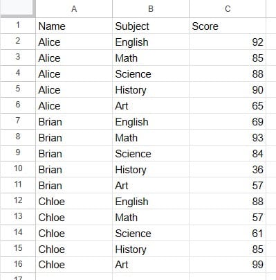
- Prepare the score data in the following format.
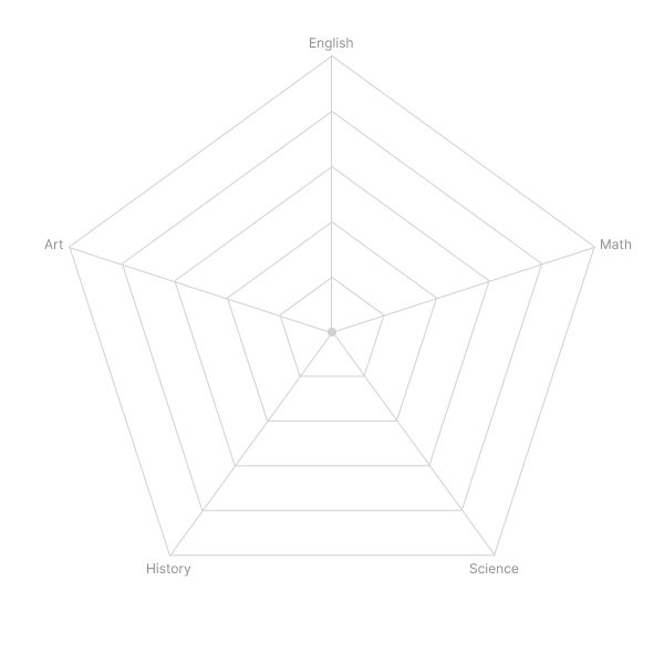
- Generate a pentagon image to use as the background of the radar chart.
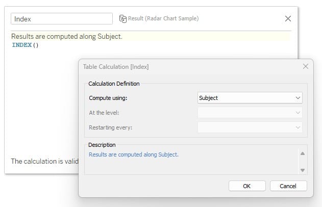
- Create
IndexandSizecalculations to determine the chart structure based on the number of subjects.
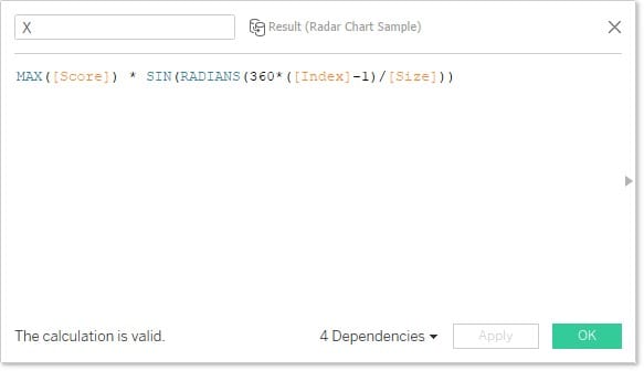
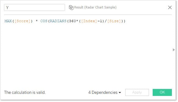
- Create
XandYcoordinate calculations so that the five subjects are positioned on their respective axes. For the logic behind these calculations, refer to trigonometric function references.
- Place the calculated fields on the worksheet as follows:
- Columns:
X - Rows:
Y - Path:
Subject - Color:
Name(set Opacity to 40%)
- Columns:
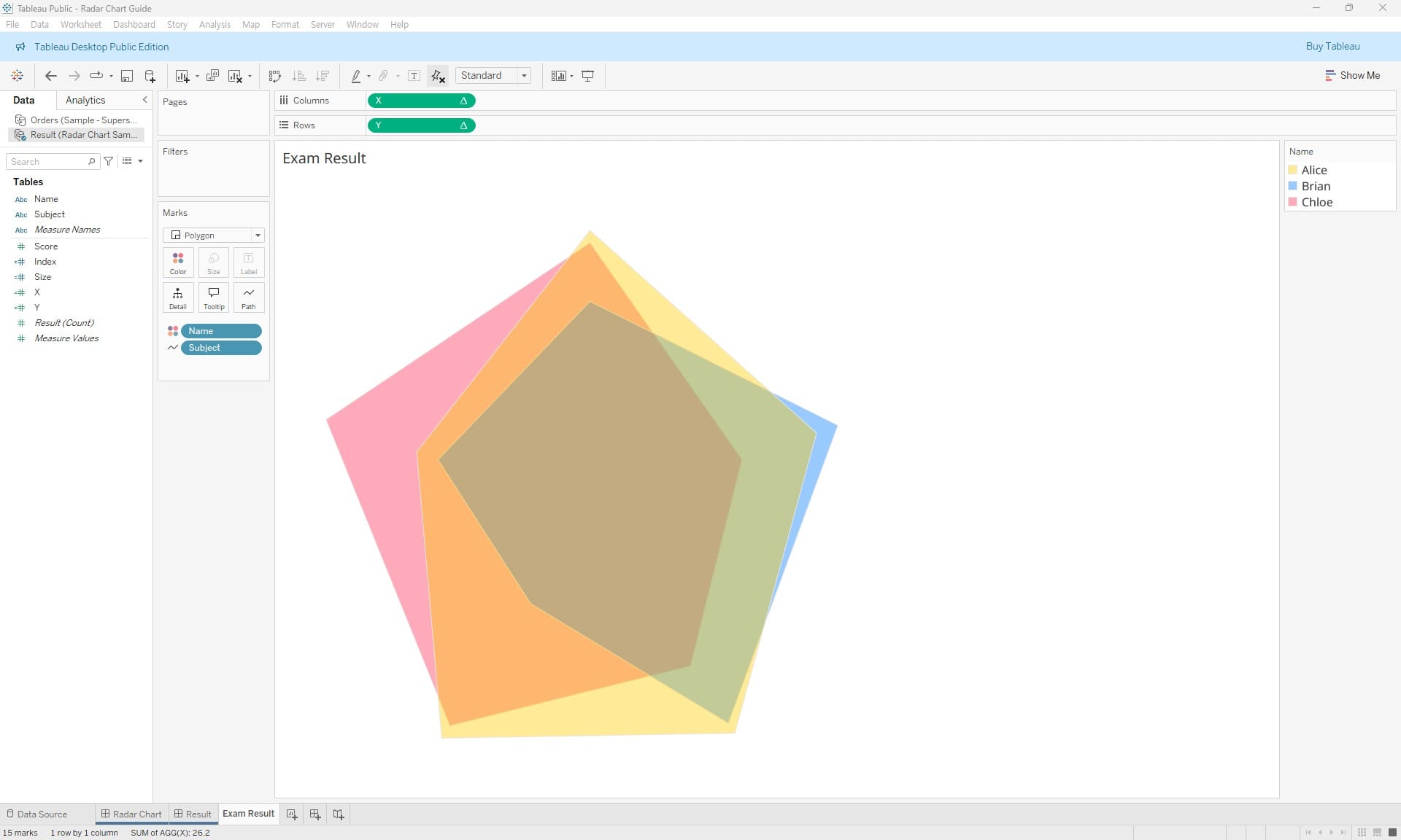
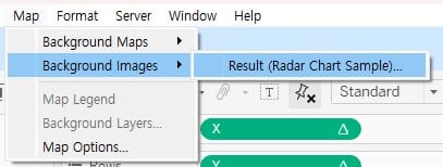
- Add the background image.
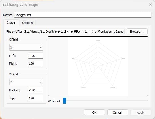
- Adjust the axis ranges according to the size of the background image placed in the sheet.
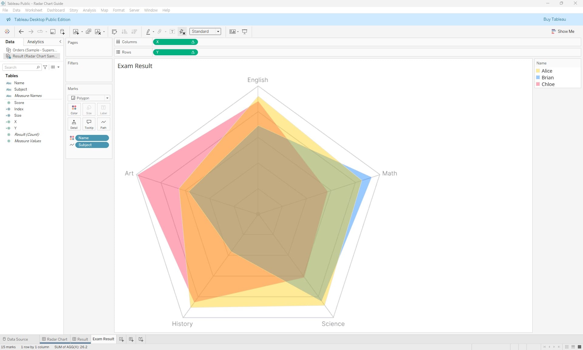
- Complete the chart.