Difference Between Top and Bottom Date Aggregation Options in Tableau
This post explains the confusing aggregation options that often appear when working with date fields in Tableau.

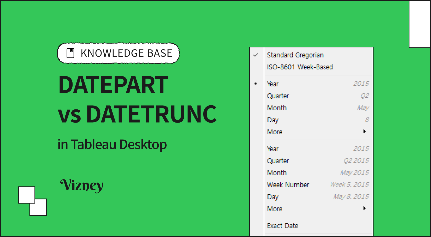
When using date-type fields in Tableau, you might notice two similarly named aggregation options when right-clicking a date field—one shown at the top and one at the bottom. Because they look so similar, many users feel unsure about which one to choose. However, these two aggregation methods actually produce completely different results, so it's essential to understand their meanings clearly before applying them.
- Top Option: Based on
DATEPART - Bottom Option: Based on
DATETRUNC
Some users mistakenly believe that the difference between the two options is simply a matter of discrete vs. continuous. While it's true that the default behavior is that the top option creates a discrete field and the bottom option creates a continuous field, this is not an inherent rule—both can be manually changed afterward.
For a deeper explanation about discrete and continuous fields in Tableau, you can refer to the following article:

Top Option: Based on DATEPART
The DATEPART function extracts a specific part of a date (such as the year, month, or day) and returns it as a numeric value.
Example:
By default, the top option creates a discrete field, meaning only the existing values in the data are shown on the axis. If there are missing dates in the data, no placeholder is displayed for them. Thus, when using this option, you must be careful as it may lead to uneven gaps on the axis.
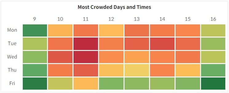
The top option is best suited for categorical comparisons—for example, creating heatmaps or bar charts that compare values by day of the week or by time slots.
Bottom Option: Based on DATETRUNC
The DATETRUNC function truncates a date to the specified date part and returns the earliest point in that unit.
Example:DATETRUNC('year', #2025-04-29#) = #2025-01-01#
By default, the bottom option creates a continuous field, meaning all date intervals are shown evenly along the axis—even if there is no data for some dates.
This makes it ideal for time series analysis, allowing you to easily visualize trends and patterns over time in a continuous flow.
When working with date fields in Tableau, the choice between the top and bottom aggregation options goes beyond just a visual preference—it defines the entire direction of your analysis. Ultimately, choosing the right method depends on the questions you want to answer and the story you want your visualization to tell.
Understanding and using these differences wisely can help you create much clearer and more persuasive visualizations—even when working with the same data.