Vizney
  • Home
  • About
  • Chart Guide
  • Knowledge Base
  • Tips & Tricks
  • Gallery
Sign in Subscribe
Gallery

Population Pyramid of South Korea

This chart shows the projected changes in Korea's population by age group from 2022 to 2072, based on data from Statistics Korea.
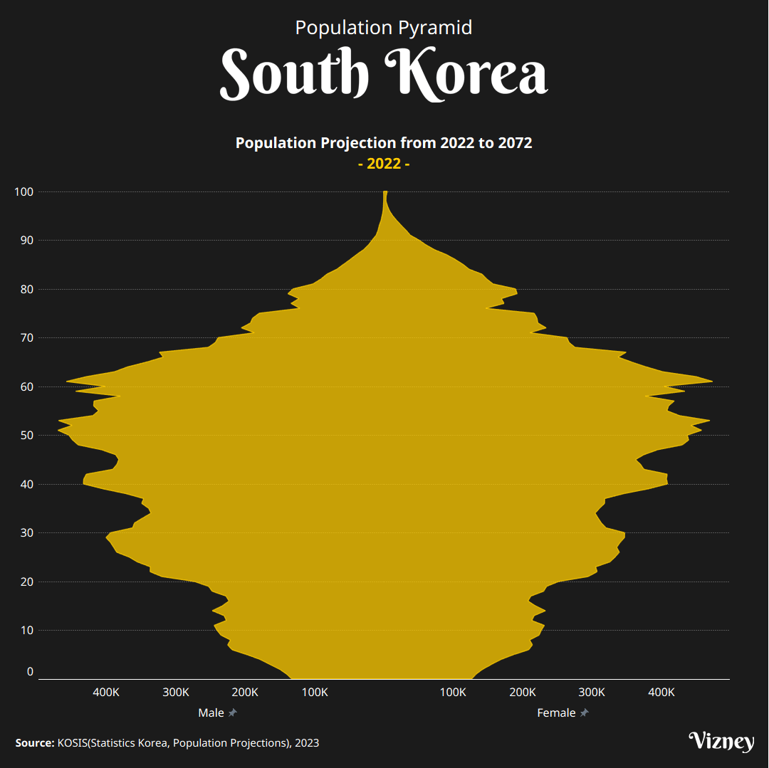
  • Yehwan Hwang

Yehwan Hwang

04 Jun 2025 • 1 min read
Share
Population Pyramid of South Korea

Source

  • KOSIS(Statistics Korea, Population Projections)

Used Tips & Tricks

How to Create Butterfly Chart in Tableau
Learn how to create a butterfly chart, a great way to compare two datasets side by side.
VizneyYehwan Hwang
Simultaneously Displaying Max, Min, and Latest Labels on a Tableau Line Chart

Simultaneously Displaying Max, Min, and Latest Labels on a Tableau Line Chart

When analyzing sales trends over time using a line chart, dashboard users typically look for three critical pieces of information at first glance: the peak performance (Maximum), the lowest trough (Minimum), and the current status (Latest value). However, Tableau’s native mark label options restrict you to choosing either '
11 Jun 2026 2 min read
How to Filter Top N in Tableau

How to Filter Top N in Tableau

Filtering the top N records based on specific criteria is a frequent requirement when building dashboards. Here are three major methods to achieve this in Tableau, along with their distinct characteristics regarding convenience, scalability, and performance. 1. Using the 'Top' Option on the Filters Shelf This method involves
03 Jun 2026 1 min read
Formatting Axis and Tooltip Independently in Tableau

Formatting Axis and Tooltip Independently in Tableau

When building charts in Tableau, you often want the axis labels to display abbreviated numbers (e.g., 10K, 20M) while the tooltip shows precise values (e.g., 10,245). However, even if you set different number formats for the Axis and the Pane, the tooltip natively inherits the axis formatting
31 May 2026 1 min read
Vizney © 2026
  • Sign up
Powered by Ghost