Simultaneously Displaying Max, Min, and Latest Labels on a Tableau Line Chart

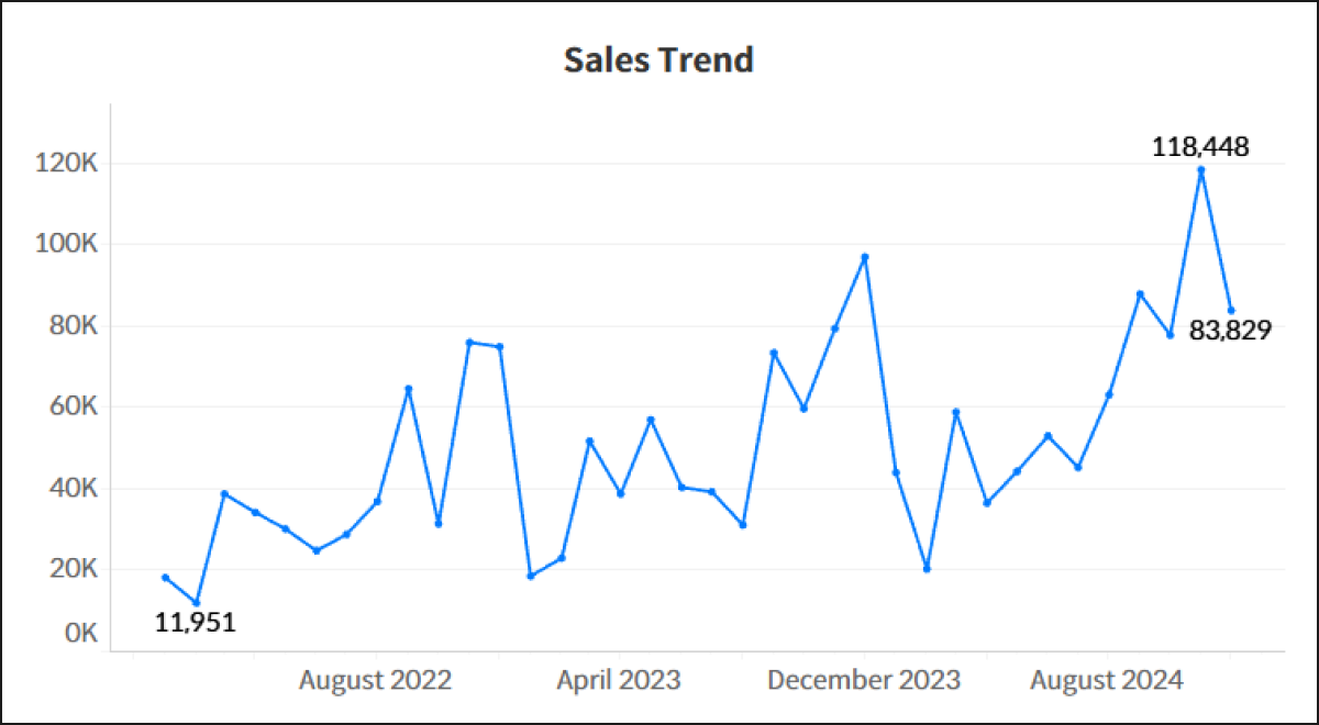
When analyzing sales trends over time using a line chart, dashboard users typically look for three critical pieces of information at first glance: the peak performance (Maximum), the lowest trough (Minimum), and the current status (Latest value). However, Tableau’s native mark label options restrict you to choosing either 'Min/Max' or 'Most Recent'—forcing a compromise that hides essential data points.
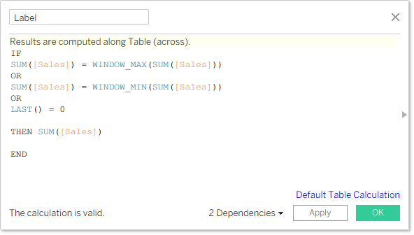
To overcome this native limitation, the most intuitive workaround is to build a custom calculated field that combines these conditions using table calculations. You can use WINDOW_MAX for the peak, WINDOW_MIN for the trough, and LAST() = 0 to pinpoint the end of the timeline. Combining them into a single conditional statement looks like this:
This basic formula is highly intuitive and works perfectly for simple trends with distinct peaks and valleys where data volatility is low. Once placed on the Label shelf, it simultaneously surfaces all three target metrics on a single line chart.
However, when dealing with extended timelines or datasets where the same maximum or minimum value occurs multiple times, you will encounter a common formatting issue known as 'duplicate values' or 'ties'. Because WINDOW_MAX and WINDOW_MIN return true for every single mark that matches the absolute highest or lowest value, a chart that hits the exact same peak or trough multiple times will display redundant labels, causing visual noise. Users typically prefer to see a single, clean label anchored strictly to the most recent occurrence of that metric.
To eliminate this clutter and handle tie-breaking scenarios perfectly, you can evolve the logic by pairing the sorting capabilities of RANK and RANK_UNIQUE against your date dimension. The expanded calculated field is structured as follows:
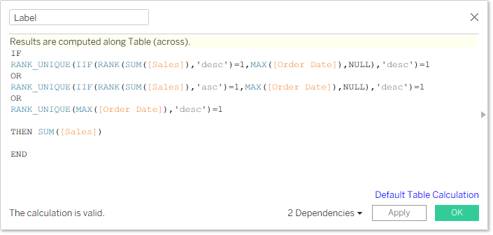
While this expression appears complex, it cleanly separates the heavy-lifting logic into three distinct blocks joined by OR operators:
- The first block isolates the absolute maximum (Max) and removes duplicates . The expression
RANK(SUM([Sales]), 'desc')=1flags all data points tied for the highest sales. If there are multiple peaks, the surroundingIIFstatement extracts theOrder Datefor only those specific points while turning all other points intoNULL. Finally, wrapping this insideRANK_UNIQUE(..., 'desc')=1ranks those specific peak dates in descending order. Since it sorts the dates dynamically, the top rank is strictly assigned to the 'most recent date' among the ties, rendering exactly one maximum label. - The second block mirrors this exact behavior for the absolute minimum (Min), with the sorting order changed to ascending (
'asc') . Even if the dataset records the lowest sales value multiple times, the label will cleanly display only on the single most recent occurrence of that minimum value. - The third and final block targets the rightmost edge of your timeline—the Latest value . It scans all dates across the view and uses
RANK_UNIQUEto dynamically sort theOrder Datein descending order, pinpointing exactly one most recent date on the chart.
By moving from basic window functions to a refined ranking logic, you can easily bypass native product limitations while safeguarding your executive dashboards against the visual clutter of duplicate real-world data points.