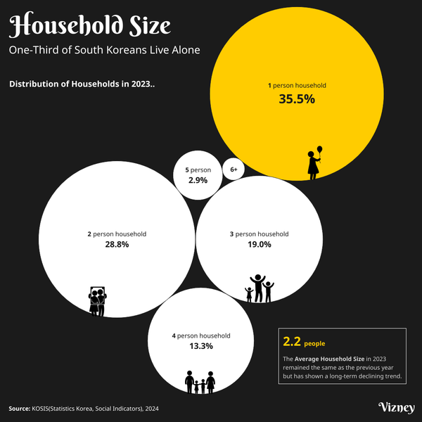
News One-Third of South Koreans Live Alone The rise of single-person households in South Korea is driven by social and economic changes, including delayed marriage and aging. This shift impacts consumption, housing, and welfare policies.
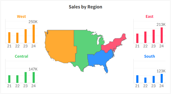
Tips & Tricks Synchronize Axis Heights Across Sheets in Tableau This guide explains how to keep the axis scale consistent for a single measure across multiple sheets.
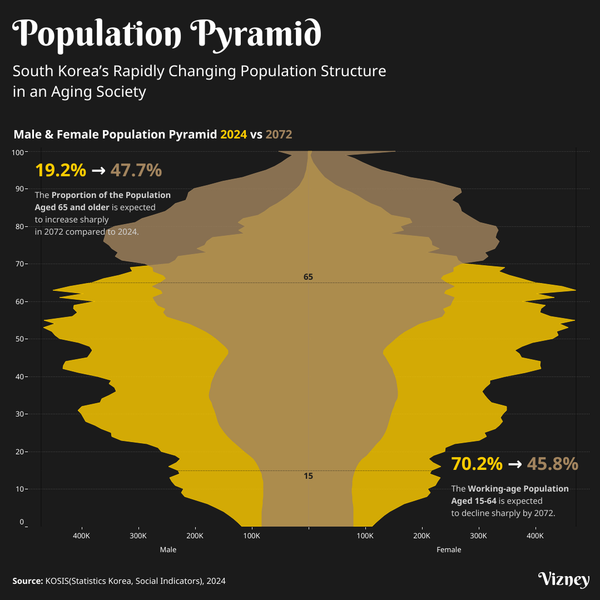
News South Korea's Population Structure is Rapidly Changing due to an Aging Society South Korea’s population is declining after peaking at 51.75 million in 2024. With rapid aging, nearly half the population will be 65 or older by 2072, posing major challenges for the economy, labor, and welfare.
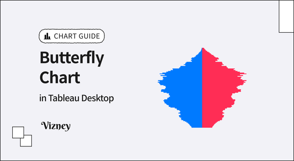
Chart Guide How to Create Butterfly Chart in Tableau Learn how to create a butterfly chart, a great way to compare two datasets side by side.
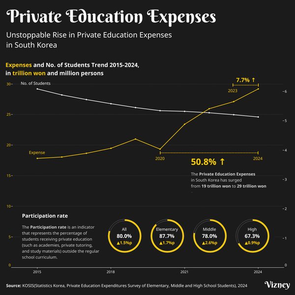
News Unstoppable Rise in Private Education Expenses in South Korea Despite a declining student population, private education expenses in South Korea continue to rise. In 2024, total spending reached 29.2 trillion KRW, up 7.7% from the previous year. This growth highlights parents' increasing reliance on private education.
Knowledge Base Difference Between Tableau Public and Tableau Desktop This article explains the key functional differences between Tableau Public and Tableau Desktop from the perspective of dashboard creation.
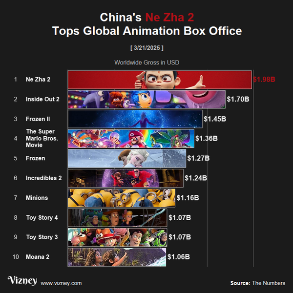
News China's Ne Zha 2 Tops Global Animation Box Office China's 'Ne Zha 2' surpassed 'Inside Out 2' last February to become the highest-grossing animated film of all time, earning an astounding $1.8 billion, mostly from the domestic market.
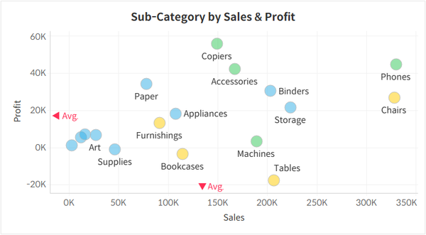
Chart Guide Using Scatter Chart in Tableau Scatter charts are a great way to visualize the distribution of data points. In this post, we’ll explore how to use them more effectively and highlight key considerations to keep in mind. Understanding Scatter Charts as a Distribution Tool Scatter charts plot data points based on two measures, one
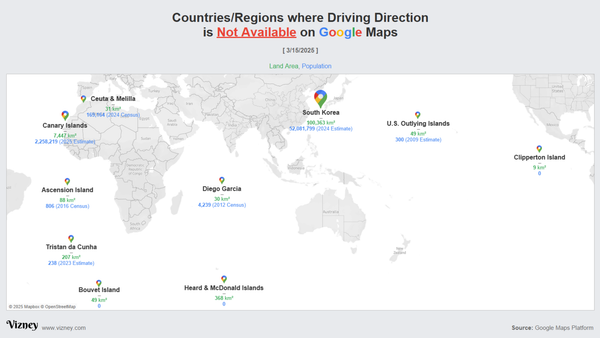
News Countries/Regions where Driving Direction is Not Available on Google Maps According to the Google Maps Platform, South Korea is the only country in the world where traffic information is unavailable, excluding regions where functionality cannot be implemented.
Tips & Tricks Adding Reference Labels with Arrows on Axes in Tableau When a sheet is too complex to add reference lines without cluttering the visualization, you can use arrows to display additional information in a simpler way.
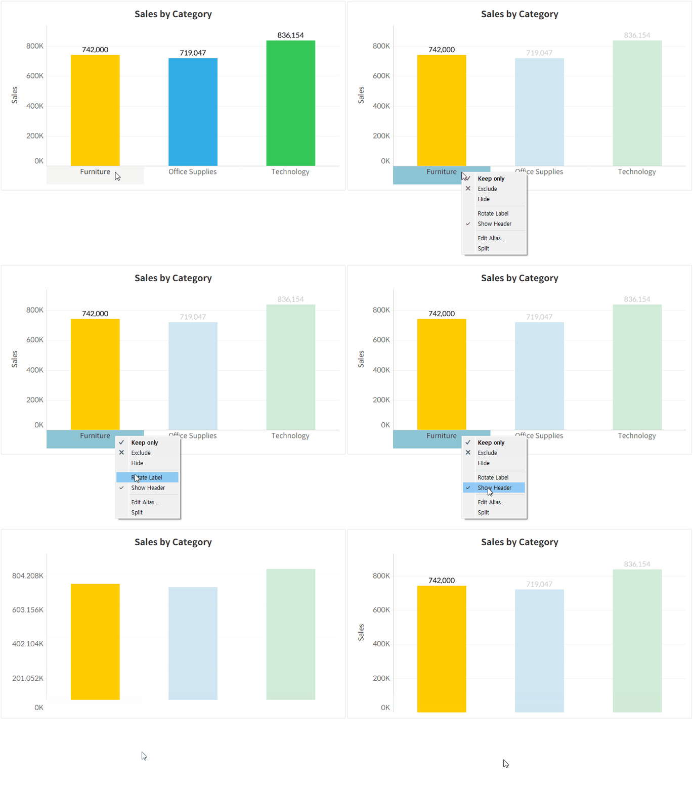
Tips & Tricks Issue of Missing Axis Rulers in Tableau Desktop This issue occurs when the header display for the column shelf is hidden.
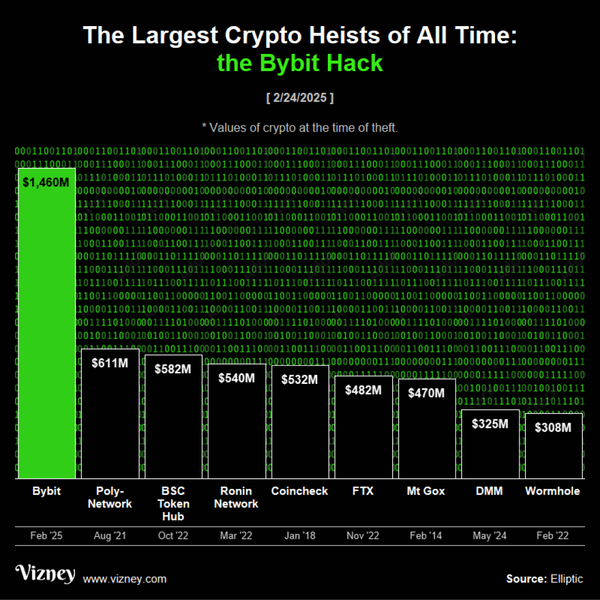
News The Largest Crypto Heists of All Time On February 21, 2025, approximately $1.46 billion in cryptoassets were stolen from the Dubai-based exchange Bybit in the largest crypto theft ever, using malware to manipulate transaction approvals.
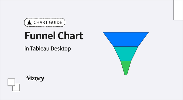
Chart Guide How to Create Funnel Chart in Tableau A guide on how to create a funnel chart, which is useful for visualizing step-by-step reductions in a process.
Knowledge Base Run Your Under Development Connector in Tableau Desktop This guide explains how to run Tableau Desktop without signature verification while developing a Tableau connector for a new data source.
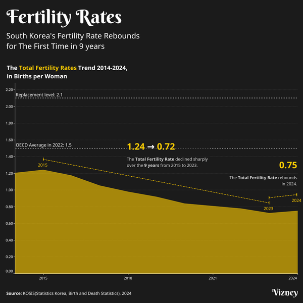
News South Korea's Fertility Rate Rebounds for The First Time in 9 years For the first time in nine years, South Korea’s birth rate has increased—a small but hopeful sign amid record-low fertility. While still far below the replacement level, this rebound offers insight into potential shifts and ongoing challenges.
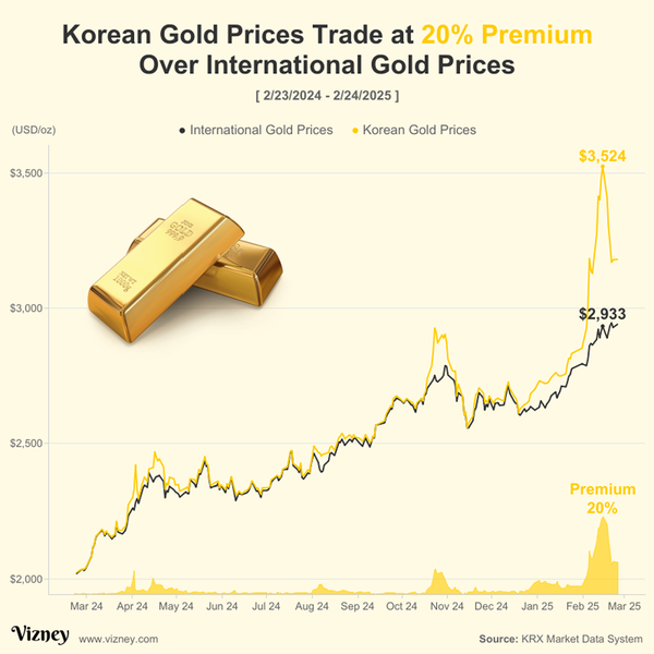
News Korean Gold Prices Trade at 20% Premium Over International Gold Prices According to the Korea Exchange on February 14, 2025, the spot gold price in the KRX Gold Market was recorded at $3,524 per ounce (oz), trading at a 20% premium compared to the international gold price of $2,933.
Tips & Tricks Easily Add Value and Display As to Parameter List in Tableau Here’s a convenient way to work with parameter lists where the Value and Display As are different.
Tips & Tricks How to Find First Non-Zero Digit after Decimal Point Using regular expressions, you can determine the first non-zero digit after the decimal point, making this method ideal for handling varying decimal places.
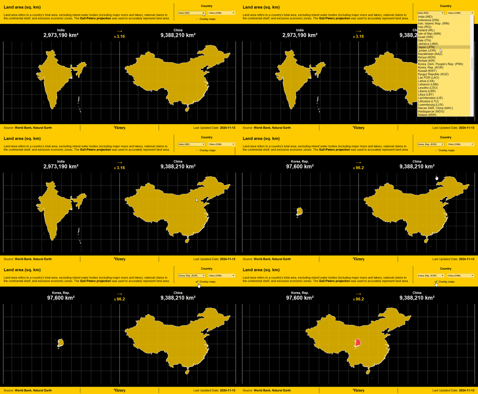
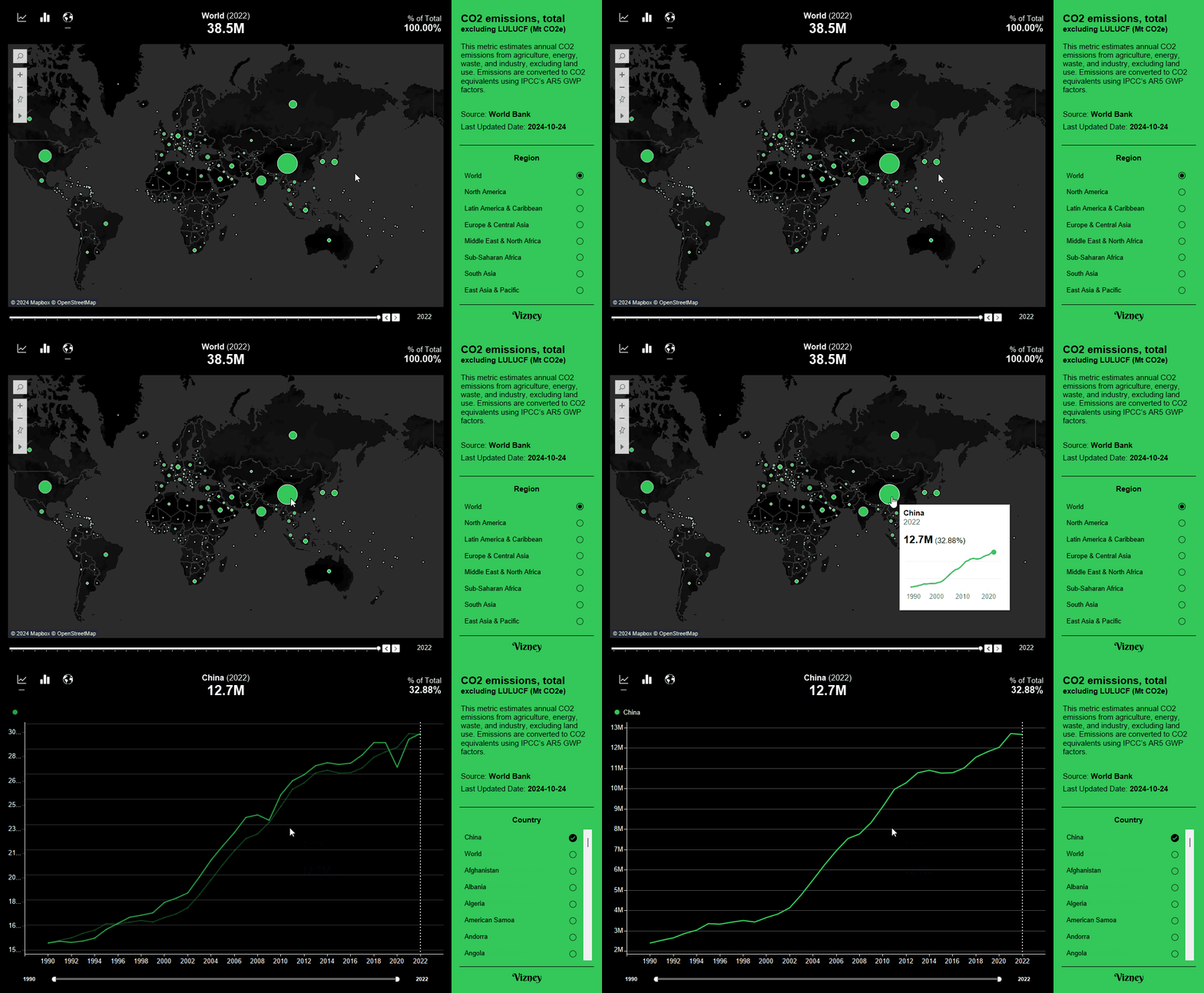
Statistics Land Area This dashboard allows you to view and compare the land areas of countries around the world.
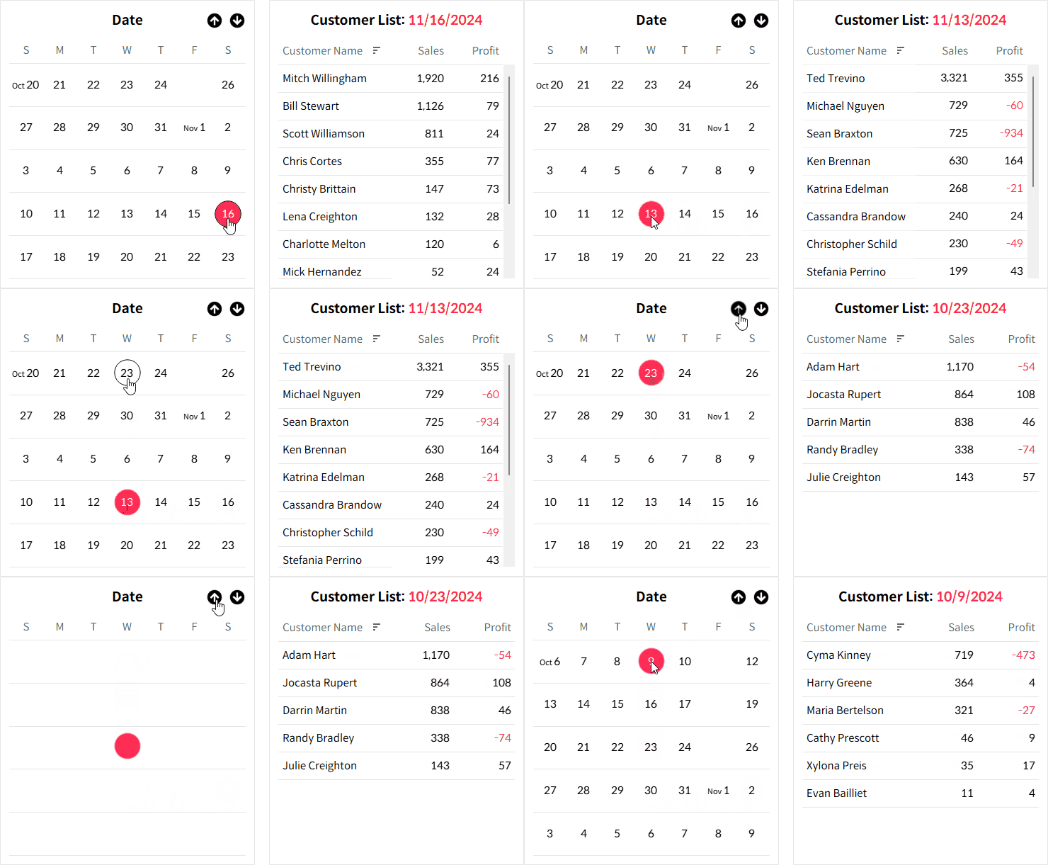
Members only Tips & Tricks How to Create Calendar Picker in Tableau This guide explains how to create a calendar-style sheet to make date selection more intuitive and user-friendly using Tableau.
Knowledge Base Difference Between Client-side and Server-side Rendering in Tableau This post explores the advantages depending on where the view is rendered.
Chart Guide Using Grid Chart in Tableau Tables remain one of the simplest and most reliable ways to present data. While more people are becoming familiar with data visualization and easy-to-use visualization tools continue to emerge, tables are still foundational. So, when does it make sense to use grid charts, and how can they be
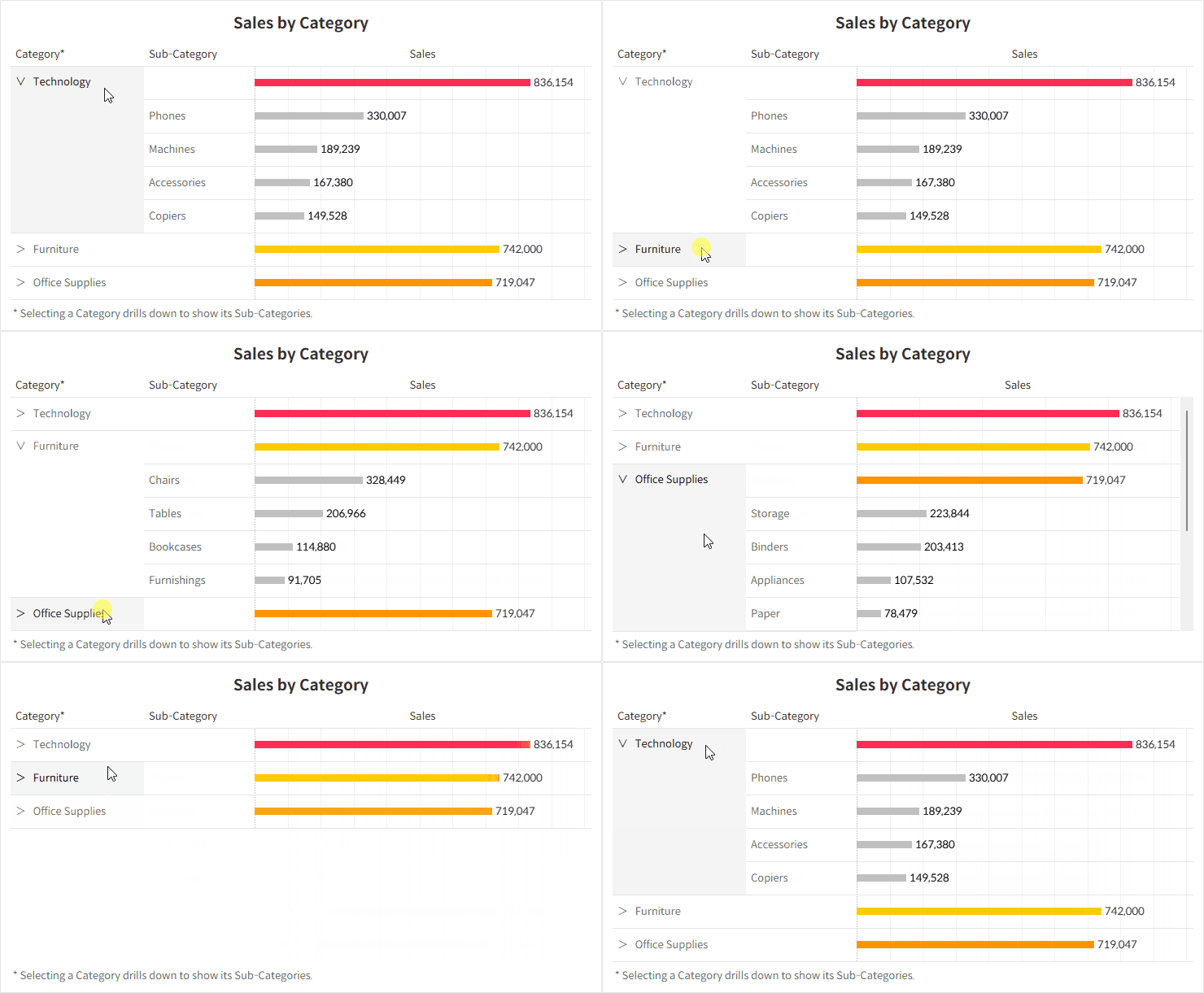
Members only Tips & Tricks How to Drill Down a Single Row Hierarchy in Tableau This guide will show you how to expand only the specific row you select to view its detailed items.
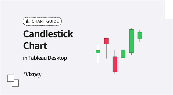
Chart Guide How to Create Candlestick Chart in Tableau This guide explains how to create a candlestick chart, commonly seen in stock charts.